N° 07 · Étude de cas · Présentation
Le pitch
Une présentation de 17 diapositives, à partir d'un seul prompt
Un exposé qui doit donner envie d'apprendre vraiment l'IA, avec ce site comme point d'entrée: 17 diapositives avec notes du présentateur, un graphique, un code QR et quelques blagues. Claude Code a produit le fichier PowerPoint à partir d'un seul de mes prompts et a vérifié chaque diapositive en la regardant. Parcourez-la ici, ou téléchargez-la et donnez l'exposé vous-même.

![The prompt, as an excerpt: “You can now also create amazing PowerPoint presentations, right? I want you to do one about The Good AI Guide. […] Make it entertaining, smart, witty, funny, lighthearted (but not silly). Make it aesthetically beautiful. […] Don’t ask me questions, just fill the gaps with your best guess.” One prompt, 17 slides: Claude Code wrote the deck as code, rendered every slide, looked at the result and fixed what was off. It could read the whole site first: the guides, the voice, the colours. A brilliant new hire with a proper brief. On the right, thumbnails of all 17 slides, this one included. How it was made, and the full prompt: goodaiguide.com/possible/the-pitch.](/images/possible/the-pitch/slide-16.webp)
Notes du présentateur · en anglais, comme les diapositives
Welcome. One promise before we start: no jargon, nothing to install, and you'll leave with exactly one small thing to do this week.
[Ask the room] Hands up if you've tried ChatGPT, Copilot or Gemini at least once. Now keep your hand up only if it's become part of how you work every day. [If most hands go down again, that gap is what the next 20 minutes are about.]
I'm Fabian. My day job is product and AI at a Swiss healthtech startup, where I'm CPO and Chief AI Officer. On the side, I write the Good AI Guide, a free site that helps people get properly good at AI. Everything in this talk is on that site, so there's no need to take notes.
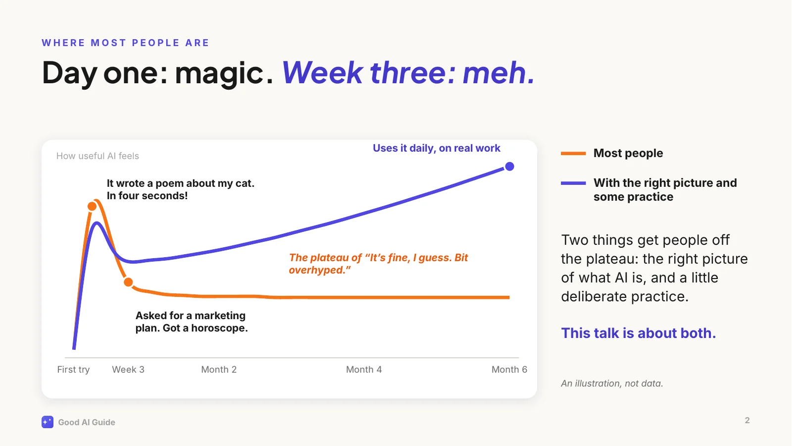
This is the curve I see over and over.
[Point at the peak] The first week is genuinely magical. A poem, a summary, a decent email in seconds. Then you ask it something that matters at work, a plan or a strategy, and you get an answer that would fit any company on earth. A horoscope.
So people conclude it's overhyped, use it for the odd email, and stay there. That flat line is where most people are today, and talent has little to do with it. Two things are missing: the right picture of what you're actually talking to, and a bit of deliberate practice.
The indigo line is what happens with both. The rest of this talk is about how to get onto it.
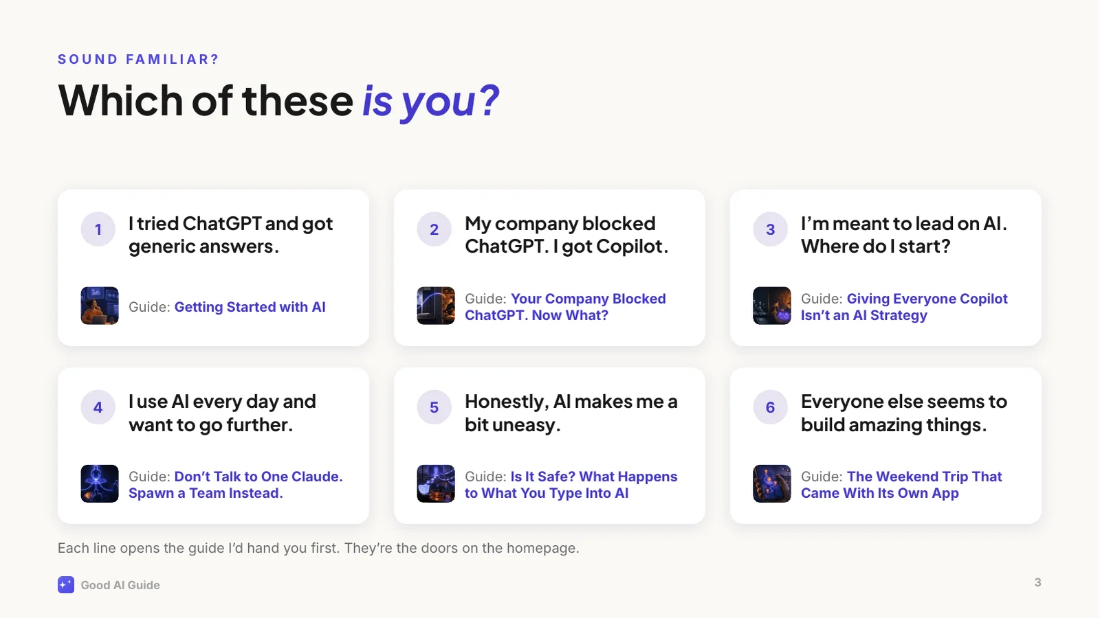
Six situations this site is built around.
[Ask the room] Which one is closest to you? Shout a number. [Wait for a few answers.]
Whatever you picked, you're in good company, and none of them means you're behind. Each has a guide written for exactly that situation, and the site's homepage shows these six lines as doors.
Two worth calling out. In my experience, number 2 is the most common one in larger companies: the good tools are blocked and you got Copilot or an internal chatbot. That's fine, and we'll come back to it. And number 5 is a reasonable place to start: the guide tells you what actually happens to what you type.
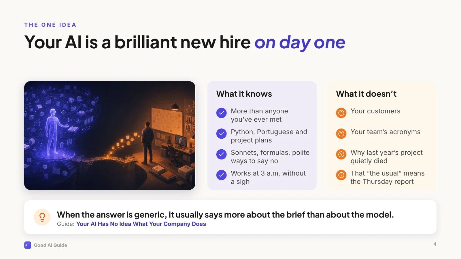
If you remember one thing from today, make it this picture.
Imagine the smartest graduate you've ever hired. Top of their class, has read everything, absurdly fast. It's their first day. They've never met your customers, they don't know your product, and they have no idea why last year's project died.
Now you walk up and say: "Write me a strategy for Q3." You'd get a textbook answer, and you'd never brief a human colleague that way. But that's how most of us talk to AI.
The picture explains the other quirks too. A new hire who doesn't know the answer but wants to please will sometimes fill the gap with a confident guess. That's what people call hallucination.
So the fix is what you'd do with any new colleague: give context, explain what good looks like, and check the first drafts.
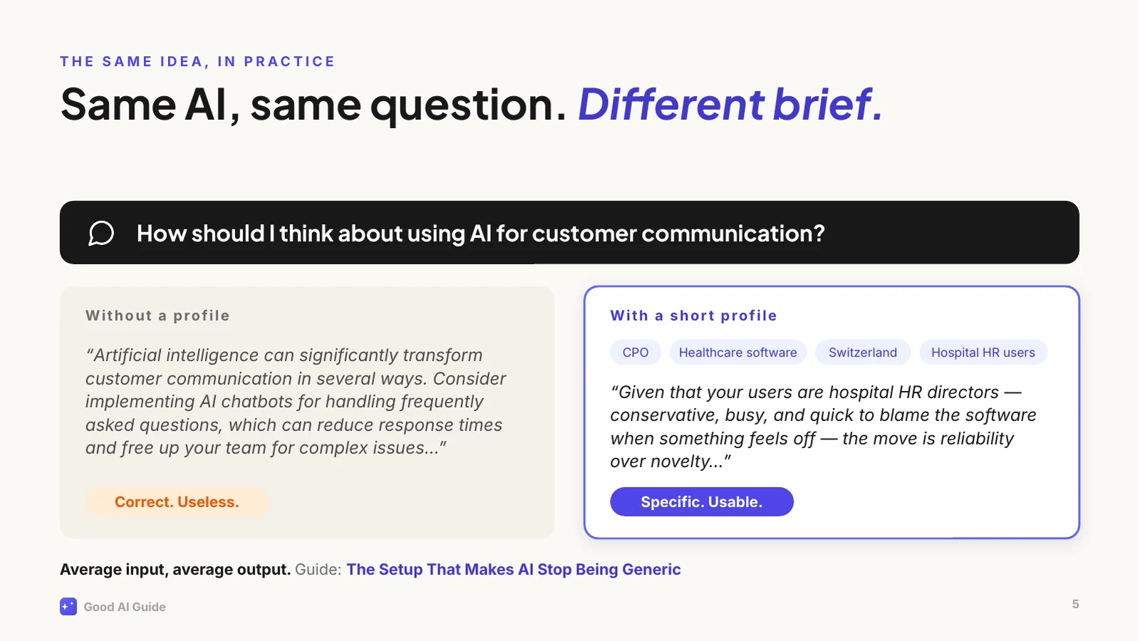
Here's that idea in practice, with a real example from one of the guides.
Same AI, same question. On the left, an account that knows nothing about me. Read it: it isn't wrong. It's addressed to an imaginary average businessperson.
On the right, the same question from an account with a short profile: my role, my industry, my country, who my users are. Now it talks about hospital HR directors and why they distrust anything that feels like a chatbot. That's advice I can act on.
Writing that profile took a few minutes, once. Most assistants let you store a profile like that, so every new chat starts from it. Where yours doesn't, paste it at the top of the chat. That alone moves a lot of people off the plateau.
So how do you get from the flat line to the rising one? Not the way most of us try.
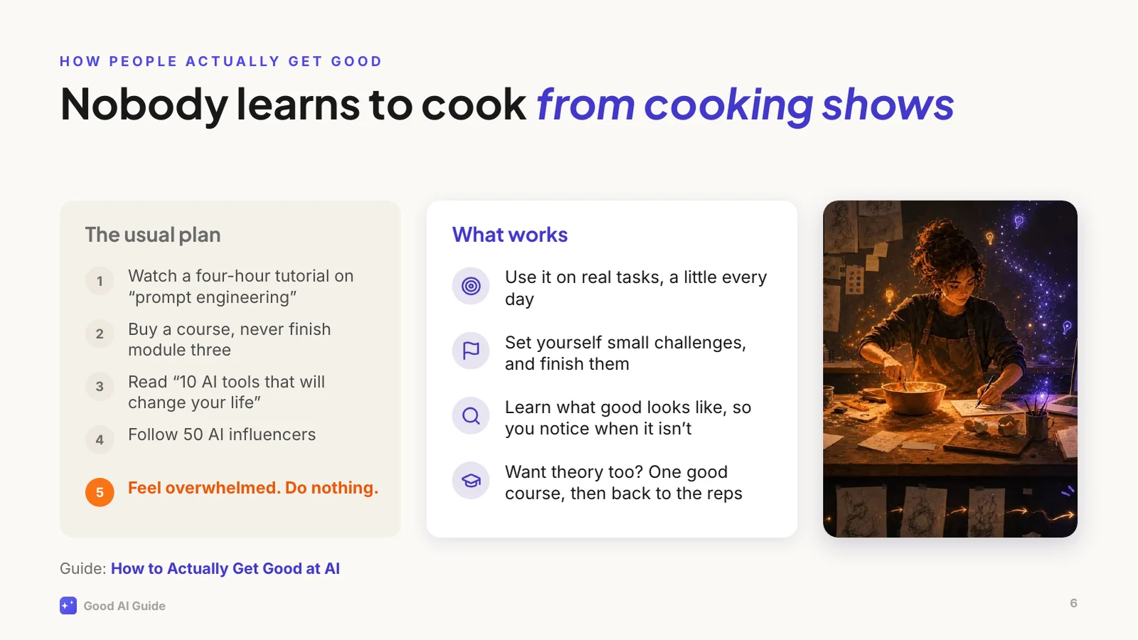
[Point left] This is the usual plan, and step five is where it usually ends. The material isn't the problem. Some courses are excellent, and if you want one, take one; there are better courses out there than anything I'd make.
But watching doesn't build the intuition you need, the same way nobody learns to cook from cooking shows. You learn by standing in the kitchen and burning a few things. With AI that means using it on real work, a little every day, with small challenges you actually finish. And it helps to know what good looks like, which is what the site's levels and checklists are for.
That's how I learned most of what I know: by using it constantly, stubbornly, and sometimes badly.
Why bother now? Because it's still early, even if it doesn't feel that way.
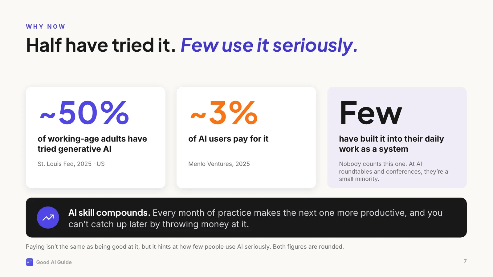
In the US, about half of working-age adults have tried generative AI. Only about 3 in 100 AI users pay for it. Paying isn't the same as being good at it, but it tells you how few people take it seriously. And the people who've built AI into their daily work as a system? Nobody counts them. I go to a lot of AI roundtables and conferences, and not long ago I worked in a large corporate myself. In both places, they're a small minority.
The second reason is that AI skill compounds. Every month of practice makes the next month more productive: you spot more uses, you brief better, you learn where to trust it. That's why you can't catch up later by throwing money at it. Being good at AI is still rare, and that won't last.
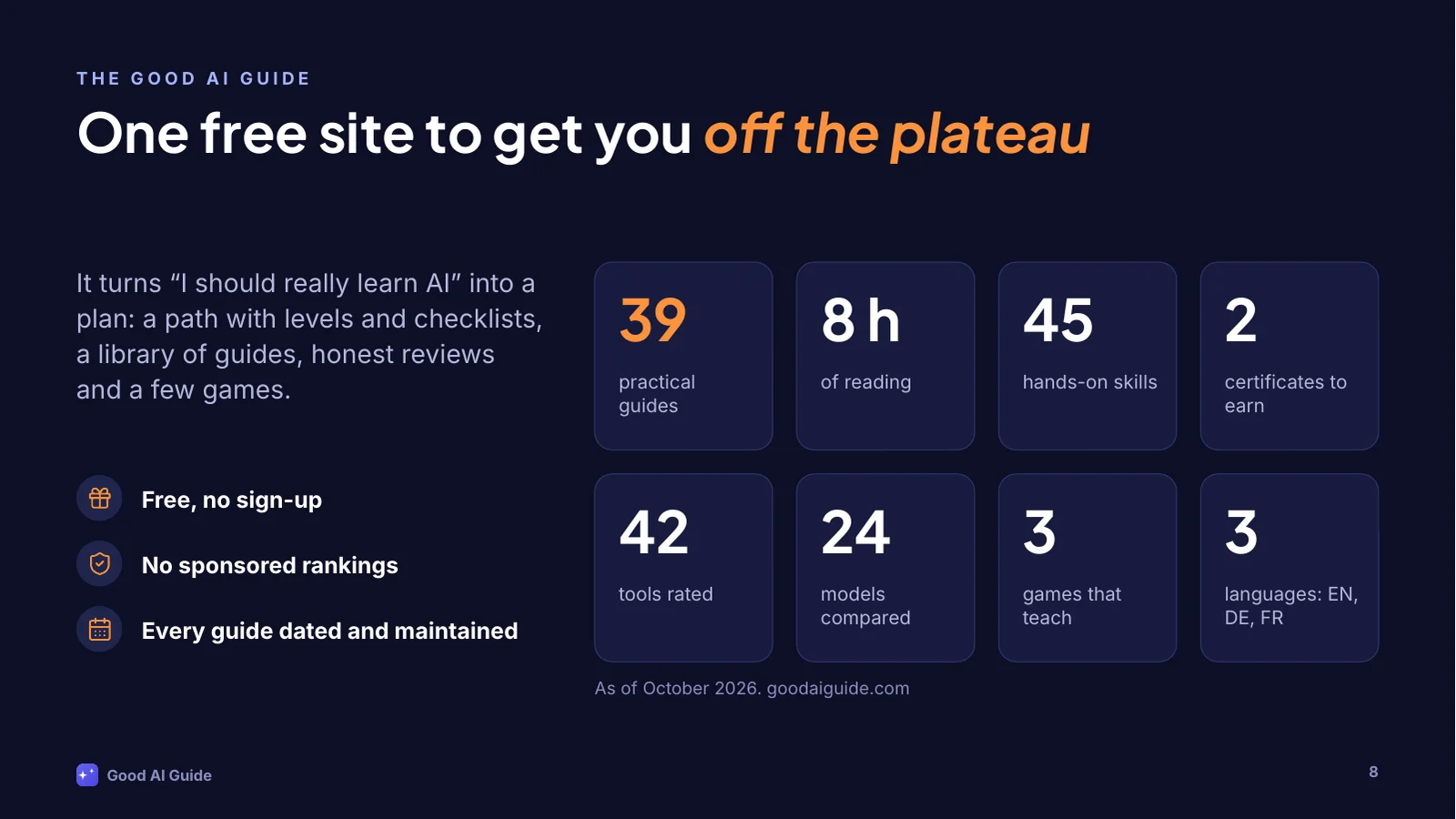
This is where the Good AI Guide comes in. It's a free site I write and maintain on the side. No sign-up, no paywall, and nobody can pay for a rating.
It started as a weekend project: I wanted to see how far I'd get building a proper site with AI tools. It has grown into this: 39 guides, about 8 hours of reading, 45 hands-on skills, 2 certificates, 42 tools with honest ratings, 24 models sorted by the job they're for, and a few games. In English, German and French.
Building it was the easy part. Keeping it current while everything shifts every few weeks is the real work, which is why every guide shows when I last updated it.
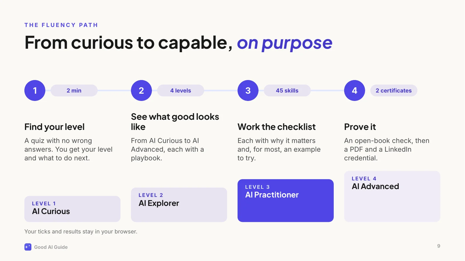
The core of the site is the Fluency Path, because "just use AI more" is terrible advice. You get good at AI the way you get good at a language: deliberately, with reps, and by knowing what good looks like.
Step one is a two-minute quiz with no wrong answers. It places you on one of four levels. Each level has a playbook and a checklist of concrete skills, 45 so far, and every skill says why it matters and usually gives you an example to try.
When you've worked through a level, you can prove it with a certificate: an open-book check, then a PDF and a credential for your LinkedIn profile.
All of it runs in your browser. No account, and your progress never leaves your device.
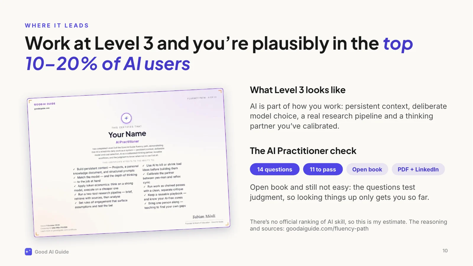
Level 3 is where the effort pays off. It's called AI Practitioner: AI is part of how you work: persistent context, deliberate choice of model, a real research pipeline, and a thinking partner you've calibrated so it doesn't just agree with you. Work like that and you're plausibly in the top 10 to 20 percent of people who use AI. That's my estimate, not an official ranking, and the site explains exactly how I get there.
And yes, there's a certificate. It's open book and still not easy: the questions test judgment, so looking things up only gets you so far. Pass, and you get a PDF and a credential for your LinkedIn profile.
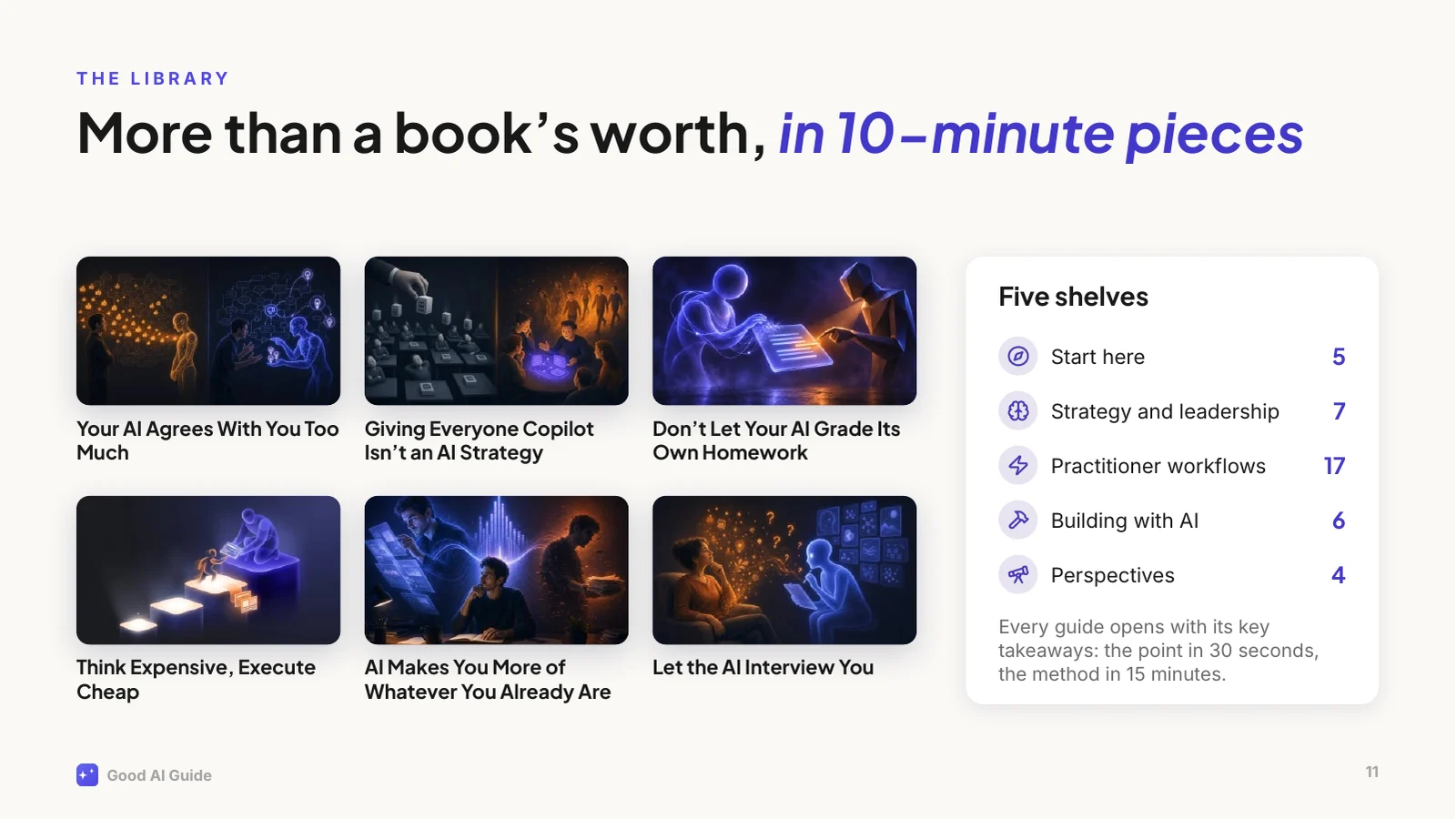
Then there's the library: 39 guides, about 86,000 words, which is more than a book, cut into pieces you can read over a coffee.
They're grouped the way I'd read them: start here, strategy and leadership, practitioner workflows, building with AI, and perspectives. Every guide opens with its key takeaways, so you get the point in 30 seconds and the method in 15 minutes.
A few examples: why your AI agrees with you too much and what to do about it; why giving everyone Copilot isn't an AI strategy; and why you shouldn't let your AI grade its own homework. They come from real use at work, including what didn't work.
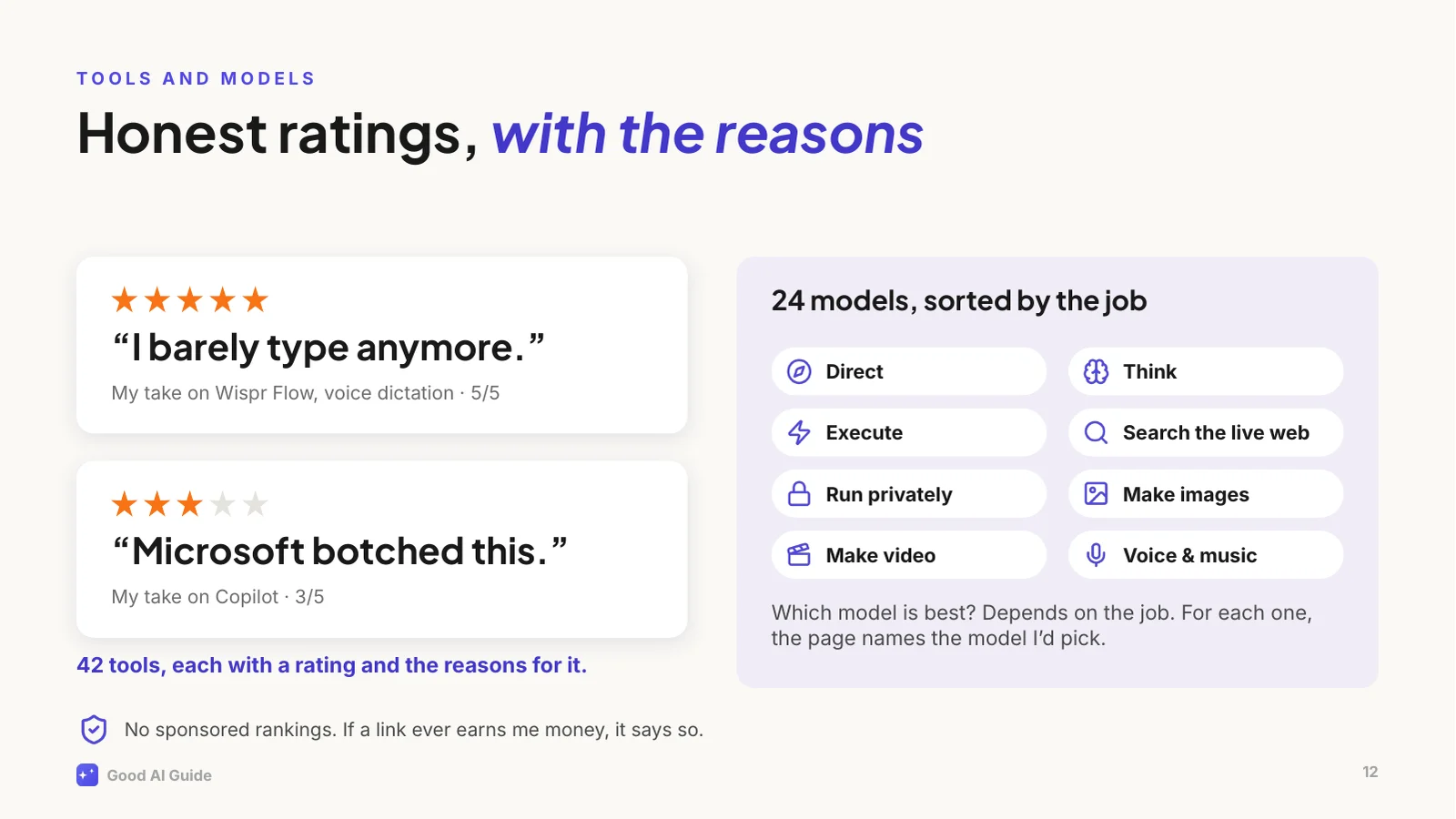
Every week there's a new "best AI tool". The site rates 42 of them, and every rating comes with my reasons: from "I barely type anymore", which is my five-star review of a voice dictation tool, to "Microsoft botched this", which is about Copilot. Copilot's model is fine, by the way. The packaging isn't.
And for "which model should I use?", the models page sorts 24 models by the job you need done: directing, thinking, executing, searching the web, running privately, images, video and voice. For each job it names the one I'd pick.
Nobody pays for a placement. If a link ever earns me money, it'll say so right next to it.
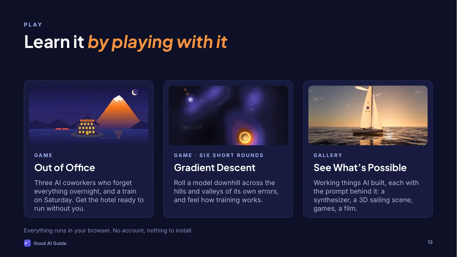
Some ideas click faster when you can poke at them, so the site has games.
Out of Office is the newest one. You run your grandmother's mountain hotel, your train leaves on Saturday, and you've got three AI coworkers from an agency who are fast, confident and slightly wrong. And they forget everything overnight unless you write it down. It teaches delegating to AI better than a slide can, this one included.
Gradient Descent lets you feel how a model is trained, by rolling it downhill across its own errors. And See What's Possible is a gallery of things AI built from a prompt: a synthesizer, a 3D sailing scene, games, a film. Each one comes with the prompt, so you can try it yourself.
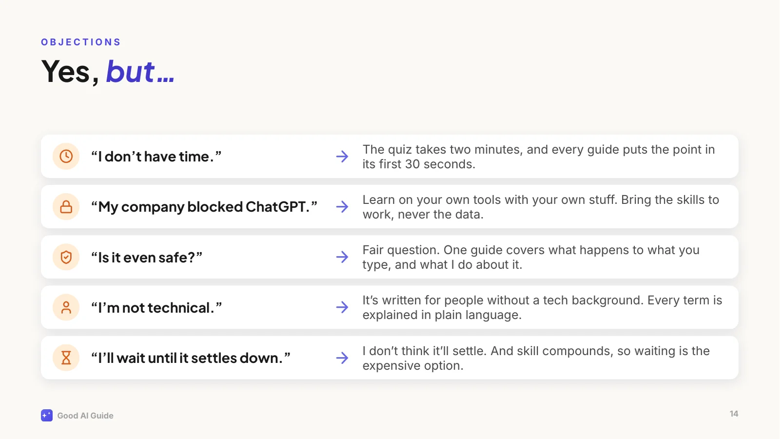
Let's deal with the objections, because I hear them every time.
"I don't have time": the quiz takes two minutes, and every guide puts the point in its first thirty seconds.
"My company blocked ChatGPT": that's normal, and usually sensible. Learn on your own tools with your own material, like planning a trip or drafting a cover letter, and bring the skills to whatever your company gives you. Never the other way round: work data stays in work tools.
"Is it safe?": a fair question, and there's a guide on what actually happens to what you type.
"I'm not technical": I write for people with a real job, no technical background and no time.
And "I'll wait until it settles down": I don't think it will. And because skill compounds, waiting is the expensive option.
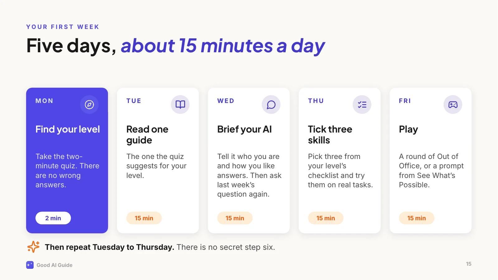
So here's your homework, and it's small.
Monday: take the two-minute quiz. Tuesday: read the guide it suggests for your level, ten to fifteen minutes. Wednesday: brief your AI properly. Tell it who you are, what you do and how you like your answers, then ask it something you asked last week and compare. Thursday: pick three skills from your level's checklist and try them on real tasks, with the tools you're allowed to use at work, or privately with your own stuff. Friday: play. A round of Out of Office, or a prompt from See What's Possible.
Then repeat Tuesday to Thursday. That's the whole method. There is no secret step six.
One more thing.
Everything you've seen in the last twenty minutes, the storyline, the jokes, the charts, the layout and even these speaker notes, was made by Claude Code from one prompt I typed. [Pause.]
It wrote the deck as code, rendered every slide to a picture, looked at them, and fixed what was off.
It could do that well because it was working inside my website's project. It could read every guide, my writing rules, the colours and the fonts. A brilliant new hire with a very good brief. That's this whole talk in one slide.
The full prompt and the story of how it was made are on the site, under See What's Possible.
That's it from me.
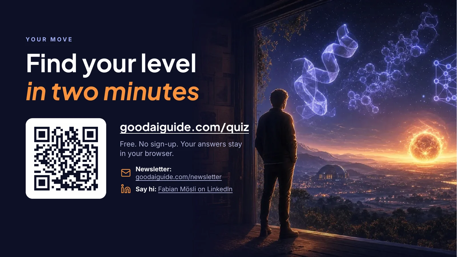
If you do one thing today, scan this code and take the quiz. It takes two minutes, there are no wrong answers, and it tells you exactly where to start.
If you'd like to hear when I've learned something worth sharing, there's a newsletter, roughly once a month. And if you'd like to talk about any of this, find me on LinkedIn. I'm always up for a virtual coffee.
[Questions?]
Le fichier PowerPoint est modifiable et contient les notes du présentateur et les polices. Les diapositives et les notes sont en anglais.
Comment l'utiliser
- ← →
- Diapositive précédente et suivante. Sur un téléphone, balayez.
- N
- Notes du présentateur: ce qu'il faut dire sur chaque diapositive.
- F
- Plein écran, pour donner l'exposé directement depuis votre navigateur.
- Télécharger
- Le fichier PowerPoint, modifiable et avec les notes, ou un PDF.
Ce que vous voyez
Dix-sept diapositives pour un exposé d’une vingtaine de minutes: pourquoi la plupart des gens plafonnent avec l’IA après quelques succès rapides, l’idée qui les débloque (votre IA est une brillante nouvelle recrue à son premier jour), pourquoi ça vaut la peine de commencer maintenant, ce que ce site vous propose, et un plan pour la première semaine. Chaque diapositive a ses notes du présentateur: ce qu’il faut dire avec elle. Sur la dernière, un code QR ouvre le quiz de deux minutes.
Je voulais quelque chose de divertissant et de spirituel, mais rien de niais, qui fonctionne tout seul et qui gagne encore quand quelqu’un le présente. Les blagues sont de Claude Code: « Day one: magic. Week three: meh. » Le plan marketing revenu sous forme d’horoscope. Le plan de la première semaine, qui se termine par « There is no secret step six. »
Parcourez-la ci-dessus et ouvrez les notes, ou téléchargez-la. Vous pouvez la présenter vous-même: comme tout ce qui se trouve sur ce site, elle est publiée sous une licence Creative Commons qui vous permet de l’utiliser en citant la source, tant que vous n’en tirez pas d’argent.
Un prompt, puis beaucoup de vérifications
Mon prompt complet se trouve en bas de cette page. Je n’ai répondu à aucune question, puisque je lui avais dit de ne pas en poser.
Claude Code travaille directement dans le projet de ce site. Avant d’écrire un mot, il pouvait donc lire ce dont la présentation avait besoin: les guides, mes notes sur ma façon d’écrire et sur ce que le site ne dit jamais, les couleurs, les polices et les illustrations. Il a d’abord rédigé le fil conducteur, un message par diapositive. Puis il a écrit la présentation sous forme de code: un script qui construit le fichier PowerPoint diapositive par diapositive, avec les images et les chiffres du site.
Ensuite, il a rendu chaque diapositive en image et l’a regardée. Le premier tour avait de vrais problèmes: les titres étaient centrés au lieu d’être alignés à gauche, sur dix diapositives du texte débordait de son cadre ou chevauchait autre chose, et les annotations du graphique se trouvaient sur ses courbes. Il a corrigé, refait le rendu et regardé de nouveau, en plusieurs tours.
Une vérification demandait un outil plutôt que des yeux. Le code QR de la dernière diapositive avait l’air correct, mais un décodeur de codes QR n’arrivait pas à le lire: Claude Code avait recopié le motif à la main au lieu de le reprendre du programme qui l’avait généré. Il a mis le motif exact, et le décodeur a lu l’adresse.
Des détails que personne n’a demandés
- Les chiffres se comptent tout seuls. À chaque construction, le script compte les guides, les heures de lecture, les compétences, les outils et les modèles à partir du contenu du site. Quand le site grandit, on peut reconstruire la présentation avec les nouveaux chiffres.
- Les polices voyagent avec le fichier. La présentation utilise les deux polices de ce site et les emporte dans le fichier PowerPoint, pour qu’elle ait le même aspect sur un ordinateur qui ne les a pas.
- La diapositive 16 se contient elle-même. Elle montre chaque diapositive en miniature, y compris la diapositive 16, qui montre la diapositive 16, qui montre la diapositive 16. Chaque tour de construction et de rendu l’imbrique un niveau plus profond; le script en fait trois.
- C’est un vrai fichier PowerPoint. Les titres sont de vrais titres, donc le mode plan et le vérificateur d’accessibilité de PowerPoint les trouvent. Les diapositives sont regroupées en sections, chaque illustration a une description pour les lecteurs d’écran, et un fondu sépare les diapositives.
Ce qui n’est pas parfait
- Keynote et Google Slides ignorent les polices du fichier et utilisent les leurs, si bien que la présentation y paraît plus sobre. PowerPoint pour Windows et Mac sait utiliser les polices intégrées à un fichier. Le PDF a le même aspect partout.
- Les diapositives ont été vérifiées dans LibreOffice, pas dans PowerPoint. PowerPoint ne tourne pas là où Claude Code travaille, donc les aperçus de cette page viennent de LibreOffice, une suite bureautique gratuite. PowerPoint coupera peut-être une ou deux lignes à un autre endroit.
- Ce sont des cadres fixes. Dans PowerPoint, vous pouvez modifier chaque texte, chaque image et chaque chiffre, mais si vous raccourcissez un texte, rien ne remonte pour combler le vide.
- Les notes sont écrites pour que je les dise. Si vous donnez l’exposé, changez la présentation de la diapositive 1 et les passages où je parle de moi.
Ce que vous pouvez en retenir
- Donnez d’abord le matériel. La présentation est précise parce que Claude Code a pu lire tout le site avant d’écrire une diapositive. Dans un nouveau chat, collez ce que vous donneriez à une nouvelle recrue: qui est le public, ce qu’il doit faire ensuite, vos notes et vos chiffres. C’est l’idée de la diapositive 4, et la version longue se trouve dans Votre IA n’a aucune idée de ce que fait votre entreprise.
- Demandez le fichier dont vous avez besoin. La plupart des assistants savent désormais produire un fichier PowerPoint. Dites-le, et dites ce qu’il doit contenir, notes du présentateur comprises.
- Faites-lui regarder son propre travail. Le premier rendu avait des problèmes sur dix diapositives, et c’est en regardant les images qu’on les a trouvés.
- Testez ce que les yeux ne peuvent pas vérifier. Le code QR avait l’air juste et ne se scannait pas. Un décodeur l’a vu en une seconde.
Le prompt, mot pour mot
Copiez-le, collez-le, voyez ce que vous obtenez
C'est tout ce que j'ai tapé. Claude Code pouvait aussi lire le projet de ce site: les guides, mes notes sur ma façon d'écrire, les couleurs, les polices et les illustrations.
Next idea for the "What's possible" section. You can now also create amazing PowerPoint presentations, right? I want you to do one about The Good AI Guide. Let's say this presentation will be shown to people to encourage them to finally kick off their AI learning journey, and to fully leverage all that the GAG has to offer. Let's say 15 content slides plus title and end slide. Make it entertaining, smart, witty, funny, lighthearted (but not silly). Make it aesthetically beautiful. Make it pleasant to read. Add whatever it takes to make a good presentation. The presentation should work on its own and get even better if someone accompanies it with a talk. Don't ask me questions, just fill the gaps with your best guess. This is to show off your capabilities, not to 100% fit into a realistic scenario.
Dans un assistant de chat, collez ou joignez le matériel à partir duquel la présentation doit être construite, et demandez d'abord le fil conducteur, puis seulement les diapositives. Pour une présentation comme celle-ci, un agent capable d'exécuter du code et de regarder ce qu'il a produit, comme Claude Code ou Codex, vous mène bien plus loin qu'une simple réponse de chat. Si le vôtre ne peut pas regarder ses propres diapositives, ouvrez le fichier vous-même et envoyez-lui une capture d'écran de tout ce qui cloche.